
Why We Keep Checking - A Short Guide to Variable Rewards, Dopamine and Digital Design
Written Resource to Accompany
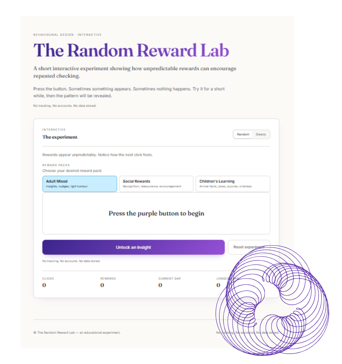
The Random Reward Lab
About this guide
This guide supports the experience inside The Random Reward Lab.
The app is not just a general dopamine demonstration. It is a simple, transparent experiment that lets users experience a small version of a reward loop, then step back and understand what happened.
During the app, users press a button and receive different types of rewards. Some may feel encouraging. Some may feel playful. Some may feel ordinary. Some may appear after a little uncertainty.
That uncertainty matters.
The point of the experience is not simply to enjoy the reward. The point is to notice what makes you want to press again.
1. What you experienced in The Random Reward Lab
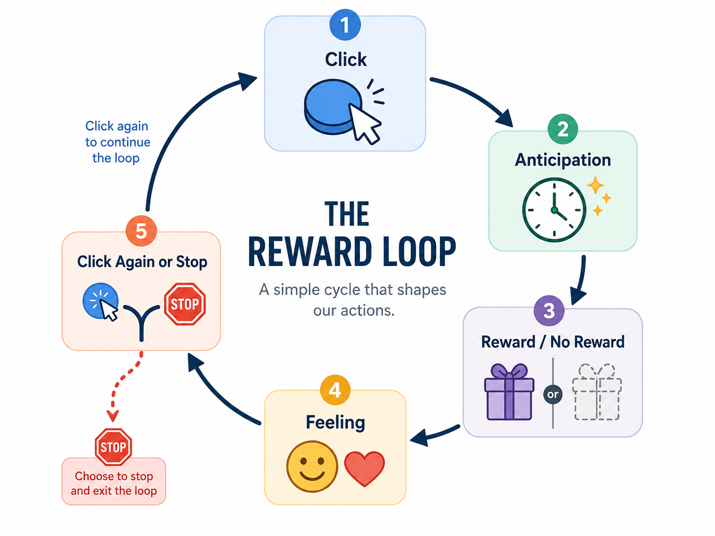
When you used The Random Reward Lab, you entered a simple reward loop.
· You took an action.
· You waited for the result.
· You received a reward, message or prompt.
· You decided whether to continue.
· Then the loop started again.
That may sound very simple, but this pattern appears in many digital products. Apps, games and platforms often use repeated feedback to encourage people to continue interacting.
In The Random Reward Lab, this process is made visible. You know you are taking part in a reward experiment. The app is not trying to hide the mechanism from you.
Key question: Did you keep clicking because you enjoyed the reward, or because you wanted to see what might happen next?
2. Why unpredictable rewards feel different
A predictable reward is easy to understand. If the same thing happens every time, the brain quickly learns the pattern.
For example: Press button → receive same message → repeat becomes less interesting.
An unpredictable reward feels different because the next outcome is uncertain. You might wonder whether the next reward will be better, different, rare or close to the reveal.
This uncertainty can increase curiosity and motivation. The reward itself may be small, but the possibility of something different can make the next click more appealing.
That is why variable rewards are used in many digital experiences, from games and social media feeds to notifications and streaks. The Random Reward Lab uses this mechanism openly so you can recognise it elsewhere.
| Reward pattern | What happens | How it may feel |
|---|---|---|
| Predictable reward | Same outcome every time | Clear, stable, may become boring |
| Variable reward | Outcome changes | More curiosity and anticipation |
| Rare reward | Special outcome appears occasionally | Surprise, excitement or pull |
| Reflective reward | A question appears | Awareness rather than just stimulation |
Unpredictable rewards can feel more compelling because the user is not only responding to what happened, but anticipating what might happen next.
3. What dopamine does — and does not — mean
Dopamine is often described as the brain’s “pleasure chemical”. That phrase is memorable, but it is too simple.
Dopamine is not just about pleasure. It is involved in motivation, learning, prediction, attention and reward-seeking.
A better way to think about dopamine is this: dopamine helps the brain pay attention to rewards, cues and outcomes that matter for future behaviour.
This does not mean every enjoyable experience is “a dopamine hit”. It also does not mean dopamine is bad. Dopamine is part of normal learning and motivation.
The important point for this app is that rewards do not only affect how we feel in the moment. They can also shape what we expect, what we notice and what we feel motivated to do next.
| Common phrase | Better explanation |
|---|---|
| Dopamine is the pleasure chemical | Dopamine is involved in motivation, learning and reward prediction |
| Rewards only make us feel good | Rewards can shape future behaviour |
| More dopamine is always better | Reward systems need balance and context |
| If something is rewarding, it is harmless | Reward design can support or exploit attention |
Dopamine is not simply about pleasure. It helps explain why rewards can influence motivation and repeated behaviour.
4. Reward prediction error: why surprise matters
One of the most important ideas in dopamine research is reward prediction error.
This means the brain responds to the gap between what was expected and what actually happened.
· If something is better than expected, that creates a positive surprise.
· If something is worse than expected, the brain adjusts.
· If something happens exactly as expected, there is less new information to learn from.
In The Random Reward Lab, this helps explain why a surprising reward can feel different from a predictable one. The app creates small moments of uncertainty: What will happen when I click? Will I get something ordinary or something better? Is the pattern about to be revealed?
| Situation | What happens | Likely effect |
|---|---|---|
| Reward is expected and received | Nothing surprising happens | Low novelty |
| Reward is better than expected | Positive surprise | Stronger learning signal |
| Expected reward does not arrive | Mismatch or disappointment | Expectations adjust |
| Reward timing is uncertain | Outcome feels less predictable | Curiosity may increase |
The brain learns from the difference between what was expected and what actually happened.
5. Wanting vs liking
Another important idea is the difference between liking and wanting.
Liking is the pleasure or enjoyment you get from something. Wanting is the pull to seek it, check it, repeat it or find out what happens next.
Kent Berridge and Terry Robinson’s incentive-salience theory argues that dopamine is more closely connected with wanting than with simple pleasure.
This matters because you can want to repeat something even when you do not enjoy it very much. For example, you might check your phone without getting much pleasure from what you see, or continue a game because the next reward could be better.
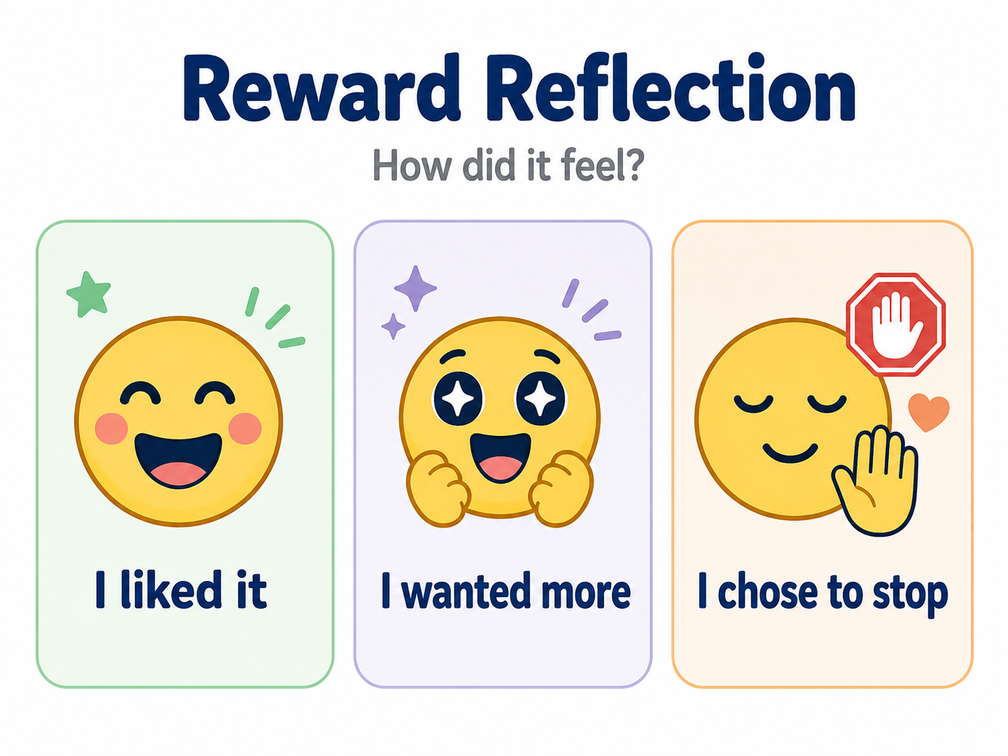
Ask yourself: Did I like the reward? Or did I want the possibility of the next one?
| Liking | Wanting |
|---|---|
| Enjoyment | Pull |
| Pleasure | Motivation |
| “That felt good” | “I want another go” |
| Satisfaction | Anticipation |
| Receiving the reward | Seeking the reward |
Wanting another go is not always the same as enjoying the reward you just received.
6. Where variable reward loops appear in everyday apps
Variable reward loops are common in digital life. They can appear in obvious ways, such as games, loot boxes, streaks, badges and unlocks. They can also appear in quieter ways, such as notifications, social media feeds, recommendations and message alerts.
The reward is not always money or a prize. Often, the reward is social, emotional or informational: a like, reply, new message, funny video, comment, badge, streak, ranking, recommendation, new piece of information or feeling of progress.
The reason these loops can be compelling is that the user often does not know exactly what they will get next.
| Digital experience | Variable reward | Why it can be compelling |
|---|---|---|
| Social media feed | Interesting post, like, comment or share | You do not know what will appear next |
| Messaging app | New reply or reaction | Social uncertainty creates anticipation |
| Game | Unlock, badge, rare item or level-up | Progress and surprise combine |
| Email inbox | Important message or opportunity | Most checks are ordinary, but some matter |
| Video platform | Recommended clip | The next video might be more entertaining |
| Fitness app | Streak, badge or progress update | Feedback reinforces continued effort |
Variable rewards are not limited to gambling or games. They appear throughout everyday digital design.
7. Digital design: helpful, playful or manipulative?
Reward design is not automatically good or bad. A reward loop can be helpful when it supports learning, motivation, healthy habits or reflection. It can be playful when it adds surprise, humour or delight.
It becomes risky when it is hidden, endless, pressurising or designed mainly to maximise engagement at the user’s expense.
The ethical question is not simply: “Does this make people engage more?” A better question is: “Does this help people make choices they would still endorse afterwards?”
The Random Reward Lab is designed around transparency. It uses the mechanism, then reveals it.
| Design choice | Ethical version | Risky version |
|---|---|---|
| Randomness | Explained or revealed | Hidden to maximise use |
| Rewards | Supports learning or reflection | Triggers compulsive checking |
| Stopping points | Built in clearly | Endless loop |
| User control | Pause, reset, stop | Hard to leave |
| Feedback | Encouraging and varied | Shame, pressure or FOMO |
| Purpose | User awareness | Engagement at any cost |
The same mechanic can support learning or exploit attention depending on how it is designed.
8. Why The Random Reward Lab includes a reveal
The app should not simply keep going forever. A reveal matters because it turns the experience into learning.
After enough clicks, the app can explain that the user has been experiencing a variable reward loop, that uncertainty can increase curiosity, that wanting another click is not the same as liking the reward, and that similar patterns are used across digital platforms.
This is one of the most important differences between an educational demonstration and a manipulative engagement loop. The user should leave with more awareness than they arrived with.

9. Reflection questions for adults
· What made me want to press the button again?
· Did I enjoy the reward, or did I mainly want to see what came next?
· Did the uncertainty make the experience more engaging?
· Did I feel curious, amused, encouraged, impatient or pulled in?
· Would this experience feel different if the app was trying to sell me something?
· Which apps in my own life use similar loops?
· Do those apps help me act in line with my own goals?
| Reflection question | 1 | 2 | 3 | 4 | 5 |
|---|---|---|---|---|---|
| I wanted to press again | |||||
| I enjoyed the reward | |||||
| I felt curious | |||||
| I felt in control | |||||
| I recognised this pattern from other apps |
Adult reflection scorecard: rate each statement from 1 to 5.
10. Reflection questions for children
For children, the explanation should be shorter and more concrete.
· What made you want another go?
· Which reward did you like best?
· Did you want to click because it was fun, or because you wanted to see what came next?
· Did you feel in control of stopping?
· Can you think of a game or app that uses rewards?
· How do you know when it is time to stop?
11. Classroom or facilitator discussion
The Random Reward Lab could be used as a short activity in digital literacy, psychology, media studies, online safety, design ethics or wellbeing sessions.
Before using the app
· How many times do you think you will click?
· What do you think will make you stop?
· Do you think rewards will make you want to continue?
During the app
· When did you first want to click again?
· Did any reward stand out?
· Did you notice yourself waiting for something better?
After using the app
· Did you click more or fewer times than expected?
· Which reward made you most curious?
· Did you feel in control?
· Where do you see similar patterns online?
· What would make a reward system fair and respectful?
| Before the app | After the app |
|---|---|
| How many times do you think you will click? | How many times did you click? |
| What do you think will make you continue? | What actually made you continue? |
| What do you think will make you stop? | What made you stop or pause? |
| Where do you already see rewards online? | Which online rewards now seem more noticeable? |
Before and after reflection sheet
12. Responsible design principles for this app
The Random Reward Lab should follow clear ethical principles. The aim is not to maximise time spent in the app. The aim is to make reward design easier to understand.
- Explain the reward loop after the user experiences it.
- Avoid endless clicking.
- Avoid shame, pressure or fear of missing out.
- Avoid making children chase stronger rewards for too long.
- Use lower click thresholds for children or classroom settings.
- Provide reset and stopping points.
- Distinguish between fun and compulsion.
- Make the learning purpose clear.
- Avoid collecting unnecessary personal data.
- Encourage reflection rather than dependency.
| Principle | Included? |
|---|---|
| Reward system is eventually explained | |
| User can stop easily | |
| No shame or pressure mechanics | |
| No endless loop without reveal | |
| Child mode uses shorter experience | |
| Reflection is included | |
| Data collection is minimal or clearly explained | |
| The app supports learning, not dependency |
Ethical reward design checklist.
13. Key takeaway
The Random Reward Lab is a small experiment with a bigger message.
Dopamine is not just about pleasure. Rewards are not just about feeling good. Digital design is not just about making things fun.
Rewards can shape attention, anticipation and behaviour. Unpredictable rewards can be especially compelling because they make us wonder what might happen next. That is why so many apps use reward loops — and why it matters that we learn to recognise them.
The most important question is not: “Did I get a reward?” It is: “What made me want to check again?”
14. Inspiration
The Random Reward Lab and accompanying written resource was partly inspired by two YouTube videos, links provided below.